Learning from misses

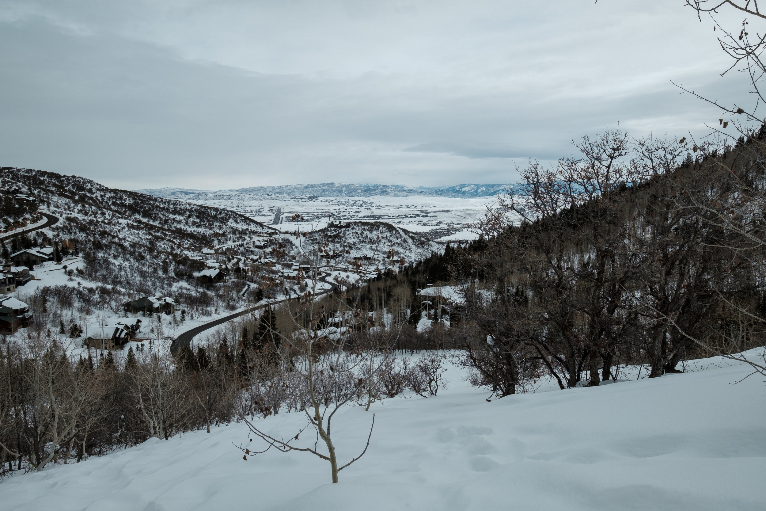
I recently came back from a trip to Park City, Utah. It is unquestionably a beautiful part of the world and yet I wasn’t able to see it creatively on this trip. My photos felt more post card than personal. More expected than intentional. More travel website than something for my portfolio.

It wasn’t the gear. I had a great camera, two lenses - including a beautiful wide angle. I had polarizing filters. I had gloves that helped me take photos even in the deep cold. I tried to push myself to see things from new perspectives - snuggling a bush here, aiming for the back light there, waking up for sunrise another time (well, a baby helps with that).

I was simultaneously struck by the vastness of the place yet unable to really capture that. Everywhere I looked beautiful landscapes were pocked by roads, modern houses, and other signs of humans taking over. Perhaps that could have been the theme that I lacked but at the time, it wasn’t what inspired me.

Despite my hopes for stronger images, I was still grateful to have my camera. To slow down and ask the questions that helped me see my surroundings in a new way. To be grateful for what I did have - and the people I was with. That’s a lesson perhaps more important than any one my images could have taught me - its more important to be grateful for the experiences we have, and to really experience them through all of our senses and feelings, than to ‘get’ a great capture.

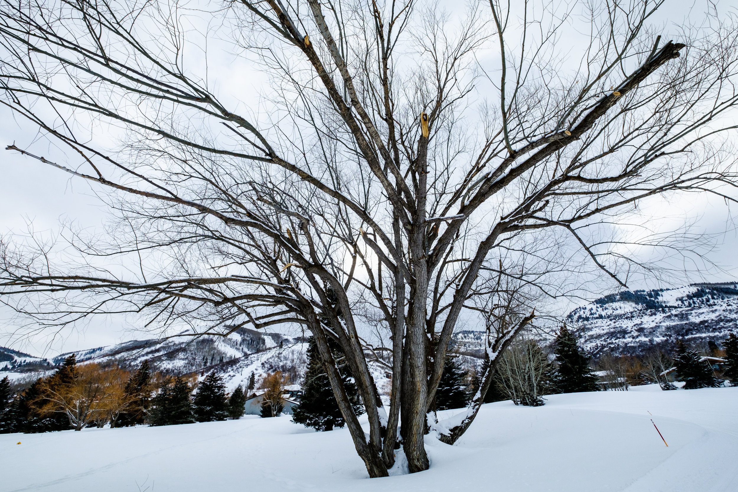
ParkCity-20190223-9569.jpg
ParkCity-20190224-9597.jpg
ParkCity-20190226-9652.jpg
ParkCity-20190223-9575.jpg
ParkCity-20190225-9639.jpg
ParkCity-20190226-9653.jpg

More bad stuff

A few weeks ago I wrote about the value of looking through old photos for the 'bad stuff'. It's an essential learning exercise for any artist, and photographers are no exclusion.

So here's some more - a look deep into the archives to explore how my craft has evolved and what I can still learn from those early shots.

Take the domes. This is a good example of where an interesting idea gets muddied by poor execution. Jerusalem is a wild city, and the powerful juxtaposition of religious symbols is a key part of understanding the past, present, and future.

On the top right are two domes from different eras and represent both how different but close the religions are in this melting pot of holiness. But that's also where this photo flops. The dome on the bottom right is cut out off, leading the eye away, there's too much empty space by the Dome of the Rock, and the whole thing is dark, hazy, and lacking clear focus. The eye wanders through the dark buildings between the domes and outward along the treeline instead of focusing on the story.

The camel sign one is a classic: potentially funny story packed with impatience. Seeing this sign in the US would be really odd, but it really wasn't out of place in the desert where camels are abundant and very useful. Had I stuck around and waited for the right moment - the "decisive moment" - perhaps a story would have emerged. But without anything else this is just a "hey, look at that funny camel."

Taken together these are good examples of ways my eye was starting to grow but where I also lacked the patience, craft, and technique to pull off what I wanted to convey.

The lesson from these photos remind me to:

  • Take notice of what draws your eye, but explore different perspectives and compositions. The first one probably isn't the most compelling print.
  • Remember the story. You can kill a story with bad composition (see domes) or lose a story without patience (see camels). It's not always easy to have the time or patience for a place (waiting for hours in the hot desert isn't everyone's cup of tea, especially if you're travelling in a group) but make those decisions.
  • Don't take pictures of big things without a focus. That landscape has like 8 things going on but nothing specifically to draw the eye. Ditch it or figure out if there's a stronger geometric composition or narrow story.